Every business that sells online has to constantly revise and improve its website and application in order not to fall behind in the never-ending ride on the market.
There are always plenty of ways to enhance key metrics such as conversions, bounce and cart abandonment rates, revenue per visitor, and more. Online store tweaking is a complex process that includes speed and performance examination, UX/UI upgrades, and advanced measures like Magento image optimization.
However, basic product descriptions also shouldn’t be neglected. What can an eCommerce store do to gain more sales and avoid failure?
In this article, we’ll talk about approaches that prominent eCommerce players use to make texts on product pages really useful, easily perceived, and selling. You’ll notice that all these examples contain a blend of tips that we’ll be talking about.
How to Create Product Descriptions that Convert
1. Give All the Necessary Information
In 2018 about 82% of mobile phone users in the USA estimated product descriptions and specs as “extremely influential” features on product pages. Only photos were evaluated higher, but just a little (83%). Another survey showed that up to 50% of shoppers return items purchased online because they do not fit the description.
So, stick to the first simple rule on our list: provide customers with all important info related to the product, its composition, size, and specific features. Take a look at how H&M makes product descriptions as informative as possible.
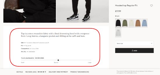
Screenshot taken on the official H&M website
Understanding that apparel is quite a complicated product in terms of buying online, the brand highlights crucial details that help to choose the right size and fit.
It’s a fairly rare example of such a precise description with mentioning the height of a model, the size of a sweatshirt in the photo, and the “True to size” bar based on reviews. Well done!
2. Underline Key Values of the Product
Basically, people want to catch the idea of a product straight away. And if crucial points are in line with demands, potential clients are ready to explore the item further.
The rule is genuinely vital for such complex goods as cosmetics or home appliances. Thus, the goal is to vividly showcase major features and benefits so that people can’t pass by.
Take a look at the screenshot below from the MAC website. The brand introduces its new foundation and gives all important details about the ingredients, usage, and core advantages. But, to make these essential points even more visible, MAC designed a separate layout with a bigger font and a photo in the background. Now everybody notices these keywords.
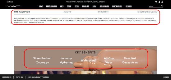
Screenshot taken on the official MAC website
3. Take Care of Customers
When it comes to cosmetics or dietary supplements, the best way to follow is to demonstrate your openness and care about customers. Tell them which components this product consists of, and give some wholesome prompts about usage and storage.
Lush successfully leverages this approach by even giving links to every single ingredient of their bath bombs. Have a look at the screenshot below. You can click and read full descriptions and be sure that this product is safe and suitable for you.
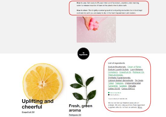
Screenshot taken on the official Lush website
4. Explain Your Product
Innovative and high-tech goods require longer considerations before adding to a cart as they are expensive and often aren’t very clear to people. Then you should find a way to convey the coolness of your items convincingly yet comprehensively. This also will substantiate the price.
In the screenshot below, you can see how wisely Dyson approached the explanation of technologies behind their famous hairdryer. They give some statistics, striking facts, and invite you to watch the video for more. That’s enough to get the concept.
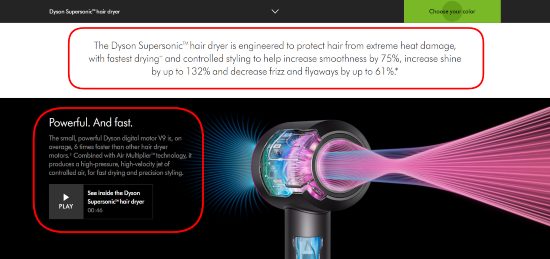
Screenshot taken on the official Dyson website
5. Organize Your Content Smartly
Sometimes you have a lot to tell your leads about a product. Here the structure is king! Create separate blocks with clear titles and use bullet points in descriptions to break large chunks of text. These tricks will enhance its perception and help you sell more online.
Even better is to hide specific details, as Ikea does on its website. In the screenshot below, you can see a brief description and two more sections: “Product Details” and “Product Size”.
When you click on the first title, you see an extended description and can choose whether to read more or not. Then you see much more specific sections, such as “Materials and care”, “Package details”, and “Assembly and documents”. You can opt for a level of immersion into the subject and won’t get confused in loads of details.
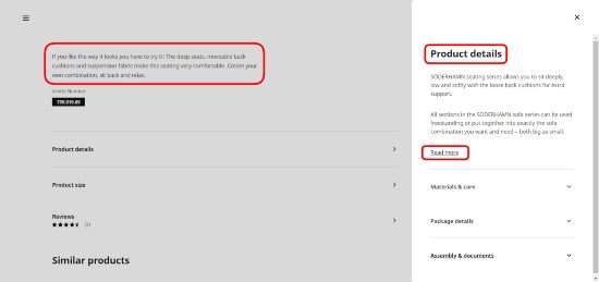
Screenshot taken on the official Ikea website
6. Keep It Concise
Finally, after the tips that we’ve mentioned above, it’s important to remind you: product descriptions ought to stay succinct. Lengthy texts tend to be tedious for users, even if organized right.
In the screenshot from Adidas’s website, you can see that the description of this pair of sneakers takes one paragraph solely. Besides this, the product page contains highlights (key benefits of the item) and details (specs) in separate blocks that are so convenient for a user.
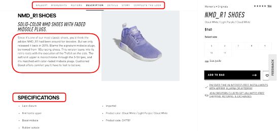
Screenshot taken on the official Adidas website
7. Create a Compelling Call to Action
Will a product description convert if customers don’t understand what you expect them to do? It may, but not as effectively as you want. That’s where you need calls to action (CTAs) to strengthen the product description. These are buttons encouraging and enabling visitors to perform a specific action. You may encourage them to add a product to a wishlist or cart or proceed to checkout.
Make buttons as clear and understandable as possible. The wording should be short and definitive, such as “Buy now” or “Add to cart”. A strong call to action has an attractive yet simple design. It involves highlighting a CTA (the primary one) to make it stand out from the rest of the text. Mobile users should easily click on the button, so mind its size for small screens.
Experiment with personalization. “Add to my cart” may convert better than the impersonal variant. A/B testing is an effective strategy to determine the best CTA wording, size, color, and placement.
Look at the screenshot from Remo Tulliani’s store below. The buttons are of contrasting colors and placed above the description section so that prospects don’t have to scroll the page.
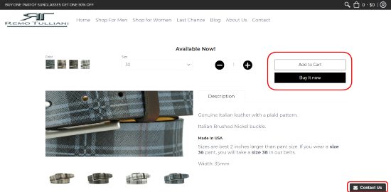
Screenshot taken on the official Remo Tulliani website
To Conclude
Of course, there are some more efficient ways to ameliorate product descriptions, such as storytelling, addressing pain points, and choosing the right tone of voice.
Experiment with them, and don’t forget about SEO optimization as well. Engage your audience with captivating information. Nicely built and structured descriptions are definitely a huge aid in transforming prospects into regular clients.
